In today’s digital marketing era, your website is the most powerful marketing tool you have at your disposal. A website has the potential to increase your audience reach and fetch you good ROI.
With proper user experience design, you can make your touch new ATH (all-time highs) now and then.
However, fast changes in digital trends and techniques can make your business website feel outdated and running behind.
With so many competitors, it can get challenging to offer the best user experience. You may go for redesigns to fit in with the trends, but you may not have enough money and time to invest in such large projects all the time.
Hence, you may feel that things are not working out as you had planned. Let’s think of a scenario. According to Google Analytics, you notice that there is a good volume of visitors on your website.
Sounds good, right? But, there’s a catch. They are not doing what you want them to do to convert leads, or even if there are conversions, the visitors are not consistent!
Here, we will discuss some effective tips to improve your website’s user experience.
What is User Experience?

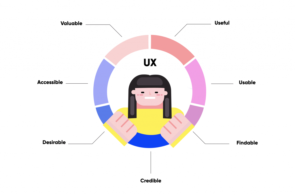
Image Source: qubstudio
Before we get into the tips, let’s learn a little about user experience. In short, it is how you can make the experience of the visitors as valuable and important as possible.
A good user experience will have a decent user interface, and it would mean that:
User Experience Design (UX design) is the process of improving user satisfaction for websites by improving usability, accessibility, and efficiency of how users interact on your website.
Ui/Ux design makes your website look easy to use and not confusing to visitors.
10 Tips To Skyrocket Your Website’s User Experience
Here are some tips that can improve your website’s user experience:
Everything starts with research when it comes to user experience design. Whenever we start designing a product, we are eager to ask, “what exactly will the product do?” But when it comes to designing your website user experience, what matters is “Who is it for?”
Knowing your niche before coming up with a design plan for your website goes a long way.
2. White space is important.
You may hear clients complain about too much white space on a website and how it can be used for advertising.
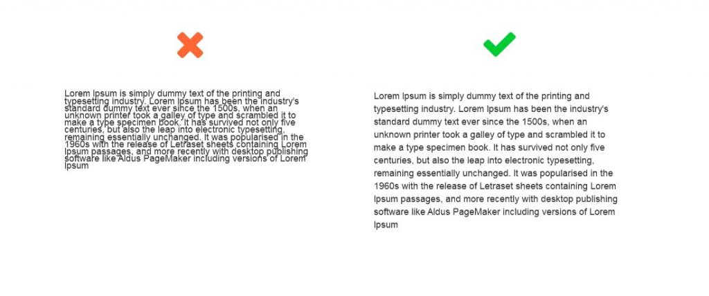
Well, white space is quite important to good user experience design. Not only does it create balance, harmony and help to brand a design, it also works as a medium to lead a reader from one element to another. It is soothing to the eye and prevents the user from getting overwhelmed with so much information.
Image Source: prototypr

3. Always start with your landing page.
What your visitor will see first when they come to your website is your landing page. The landing page should represent your brand and how it can be useful to your visitors.
Make sure that your landing page is free of any annoying popups, chat boxes, and auto-played elements. Provide them with tools to do whatever they want on the website by themselves; do not push to do certain actions.
Stay original; that’s how you stay ahead in the competition. If you offer original content to your visitors, which are relevant to them, your user experience will stay on top.
One of the most important objectives for UX designers is to have a visually distinct page layout. It is done to have a flexible user path and appealing user experience.
In short, make it easy for your visitors to find what they are looking for on your website without any hassle.
Image Source: engageinteractive

One of the most annoying experiences that users face is the loading time for pages. People are accessing content on their mobile phones all over the world, and the general attention span of the human mind is quite less. The ideal loading time for a website should be 2-5 seconds. Some of the best ways to improve page speed are:
We have often come across websites with web design that is begging for attention and leads. Do not be like them. Avoid loads of colours, animations, endless popups, and so on.
Nobody likes a poorly designed business website. When it comes to aesthetics, you need to keep it simple, creative, and to the point. Your web design should walk the talk.
Whether you run an eCommerce website or subscription-based cloud service, you need to ensure that your conversion processes are smooth and easy like the loading speed of your website, so it can be understood and utilized.
In most cases, your customers are aware of the content that is important to them.
Calls to action should be marked with an action word to make your website users easily navigate to your site and get exactly what they seek in the location they want to find it.
Image Source: uxtools

In today’s time, we all have a smartphone with us and we can access anything anytime anywhere. What’s the point of a website if it is not mobile-friendly?
It is like driving a car with a bad engine that will not take you much far ahead. The website should have a simple user interface in the mobile version. Being mobile-friendly will fetch a wide range of visitors to your website.
In a Nutshell…
Now that you know some of the basic tips to improve your website’s user experience, you must remember that these are only basics.
At the end of it all, the key to outstanding UX design is to cut off everything that comes between a user and the data/element they are looking for.
The goal is to offer value to your website users. Now that these tips will assist you to improve the user experience of your website, what is the design process that you plan to follow?